5 CTA tips to boost clicks and conversions

The Call to Action button (CTA) is an important element in your display ad. It has a psychological effect to it, in that it reminds the viewer that the ad is meant to be clicked. Although display ads are not known for their amazing click through rates (CTR), there is a lot you can do to generate a boost.


Display is an integral part of the online marketing mix, so if you’re spending any budget on the channel at all, you need to get your ad right. Here are 5 tips that will help you come up with a well performing CTA. If you think they’re useful, you can find more in our guide 30 tips for the ultimate call-to-action button.


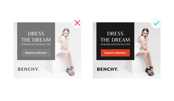
  1. There is no best-performing color, so use contrast
    The most frequently asked question we get is: “What is the best color for my CTA?”. The truth is that there is no best color. It’s in our nature to notice contrast. A study published by Kissmetrics underscores this. A popular technique is to simply use the same colour as the background behind the button, so the text on the button is almost like a cutout of the button itself, revealing the background behind. Our final answer is: Make your CTA a color, have it stand out from the background and have it grab the attention.
    tip1
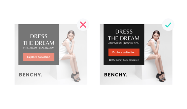
  2. Use micro-copy above or below your CTA
    Micro copy may help your audience understand why they should click your CTA and what will happen next. “Free delivery and returns” is a great example of useful microcopy that supports your CTA. Adding social prove may help break down inhibitions towards your offer. For example, put “100% money back guarantee” in the microcopy and watch your clicks and conversions skyrocket!tip2
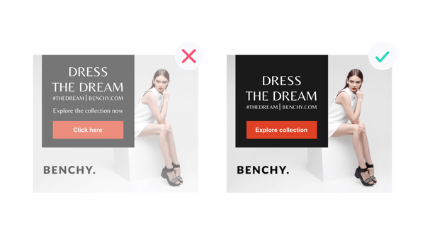
  3. Be predictable
    Your audience doesn’t like to be on the fence about your offer. If you’re not clear, odds are that their decision to click your CTA is going to have an unfavorable outcome for you. Make sure your audience will understand what the value of clicking your CTA is and what will happen next. A next step should be relevant to your audience’s time and place in the buyer journey. Note that, like the rest of your ad, your CTA needs to be consistent with your landing page. If you’re inconsistent, your audience will become uneasy which is killing for your post-click conversions.tip3
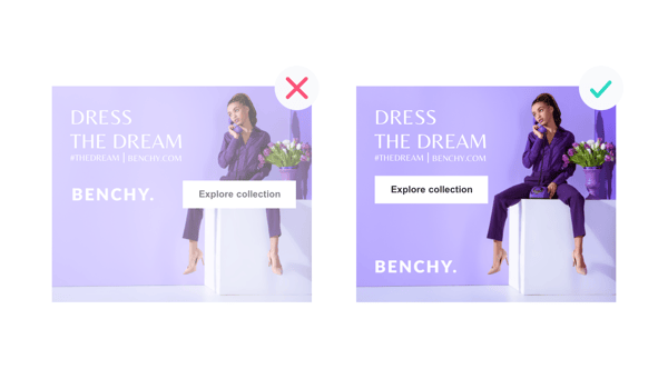
  4. Place your CTA-button logically
    Most people read from left to right, and from top to bottom – meaning that the bottom right of the ad is what’s known as the terminal area. We naturally progress through text this way. Placing your call to action in the terminal area makes it quick and easy for users to find and click your button because it’s in the area where their viewing pattern ends. There are some exceptions to this rule that may allow for bottom center or even middle center placement of your CTA. A/B testing is very helpful to figure out what works best for your ad.
    tip4-1
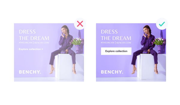
  5. Make your button look like a button
    Most buttons are fitted to the text they feature. Sometimes buttons are styled to fit in with the design seamlessly and end up not looking like a button at all anymore.

tip5-1

And other times buttons are simply way too large. A test by Unbounce shows that a larger button had caused a 10% decrease in conversions. Yikes! Based on our experience, a button should look like a button and not be too large. Adding an arrow to your button may help, as well as a subtle animation to emphasise the button.

This blogpost is an excerpt from our white-paper: 30 tips for the ultimate call to action. Get it here.

Looking to increase the ROAS of your campaigns?

Let us know about your challenges and we'll discuss how to improve the performance of your display and social campaigns
Schedule a call

What to read next

3 ways to improve your marketing campaign results

The pain of digital ad production and how to solve it

4 benefits of using animated HTML5 ads in your display campaigns